ORB develops interactive dashboards to enable our clients to easily analyse their data and visualise the results.
Microsoft’s Power BI software allows us to create intuitive dashboards that help clients organise, visualise, and understand their data. These dashboards are tailored to the requirements of each project, allowing users to analyse data without requiring statistical expertise. By simply clicking on dropdown boxes, users can see how their data varies between key subgroups and see the results presented through customised charts, infographics, and maps.
As part of the design process, ORB works with clients to identify the most useful subgroups for analysis. Some examples include:
- Demographic groups (age, gender, ethnicity, income);
- Media users (social media users, radio listeners)
- Attitudinal groups (pro-government, trust religious leaders); or
- Geographic (national, regional, urban Vs rural)
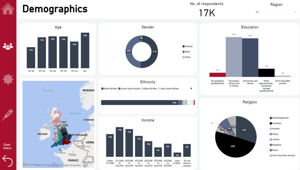
Example of ORB Power BI Dashboard
Additionally, Power BI enables users to visualise data over time in projects where ORB carries out multiple waves of the same study.
Once developed, the dashboard can be hosted securely by ORB and is password protected or published online enabling the dashboard to be shared outside of your organisation.
Click here to interact with one of our public dashboards, which uses data from a survey of 17,000 adults in the UK in 2020 as part of a project for the Vaccine Confidence Project.
Interested in learning more about ORB’s dashboards? Please contact us for more information or email Richard Hooper at rhooper@orb-international.com.